UI 2.0 is Now Live!
The Main Menu has a new look! This update has been a long time coming, and we have a lot to tell you about it. Before we get into that, though, just take a look at it!
The new Main Menu isn’t just an aesthetic upgrade – it’s a functional one! The new Main Menu is more organized, offers more customization options, gives users more information, and allows us to add more features to VRChat in the future (things like customizable, skinnable menus for world creators! Localization! Quality of life improvements! Tons of stuff we haven’t even thought of yet!).
On top of that, core upcoming systems like groups and the creator economy couldn’t happen without it.
…and that’s all before we get into the new HUD!
There’s so much new here that we couldn’t possibly cover it all in this blog post. Instead, we’ll first run down our thinking behind the new Main Menu, and then we’ll go through some of the new features that you can expect to see when you hop into VRChat.
Upgrading the Main Menu
The old Main Menu was the product of necessity. To be blunt, for a long time VRChat was being built by a very small team. We didn’t have the time to put together the perfect UI – good enough was all we needed.
After all, crafting a beautiful UI that looks good (and performs well!) in both desktop and VR is a challenge. Over time, though, the team grew, and we were able to sketch out and build a UI that would be aesthetically pleasing, fast, and easy to use, yet customizable for power users.
You’ll notice the new Main Menu looks a lot like the Quick Menu – that’s intentional! We wanted to make sure that VRChat has a consistent design language, both for aesthetic reasons and practical ones. Likewise, you navigate them in similar ways.
We wanted to make sure that the menu was intuitive to VRChat users. This way – even without having used them before – you should easily be able to find the information or features you’re looking for.
Most of the tabs can also be customized. It’s possible to minimize the left-side bar on some of them, which should let experienced users see more information while hiding descriptions or text boxes they don’t need. There are a bunch of new Main Menu Wings, too. These can be customized just like Quick Menu wings, and should help you navigate VRChat a lot faster than before.
We’ve also baked in some other new ways to customize the Main Menu. One of these ways is the ability to change the image in the background. While all users will have the option to change between 3 different images, users with VRChat+ will be able to choose between 37!
As you can see in the gif below, all of these backgrounds are parallax – which should make them extra fun to play with in VR.
Exploring the Main Menu Tabs
The new Main Menu has been broken down into tabs. You can see these here at the bottom:
When you click them, you’ll be brought to individual sections, some of which are upgraded sections of the old Main Menu, and some that are brand new.
While we won’t be going over every tab, here’s a brief overview of some of them and what they do.
Launch Pad
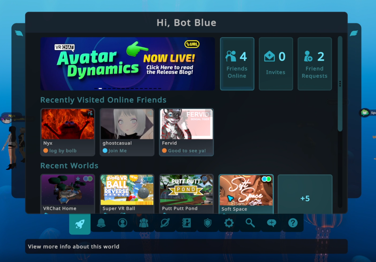
The first thing you’ll notice when you open the Main Menu is the Launch Pad. The Launch Pad is an entirely new section that shows you a bunch of useful information at a glance.
You’ll be able to quickly see how many friends you have online, how many pending invites and friend requests you have, what worlds you’ve been to recently, if any of your favorite worlds have received an update, and who you’ve recently hung out with.
This way, there’s less friction between you and the stuff you want to do when you sign into VRChat.
World
The world menu has been completely redesigned. Our main goal here was to improve discovery, and to encourage users to explore more.
The first thing you'll notice is VRCat's Variety Box! This new landing page features a random world from many different categories, giving lots of worlds a chance at the limelight. Click the "Shuffle" button in the top right to get a new selection of worlds, or dig into an individual category on the right side.
As mentioned earlier, you can minimize the left-hand side menu here to see more displayed worlds. If that's still not enough for you, you can click the top right grid icon to squeeze even more worlds onto the page.
We also have more room for categories, giving creators more chances users will discover their worlds.
Social
The social menu has also changed! Just like the world menu, you can see far more of your friends at once now. We know users with a lot of friends often have trouble scrolling through all of them – which can make it difficult to figure out who you might want to hang out with.
Now, you can see at a glance who you can join, as well as who is hanging out in private worlds.
Just like with the world menu, power users can minimize the menu on the left side. This way, you can see even more of your friends at once. You can also quickly navigate through your friend groups, as well as your offline friends, and any users you’ve blocked.
Search
Search in VRChat is changing – a lot!
First, when you first enter the search page, you’ll be presented with a series of random queries. When you reload the page, the queries will be randomized. We want to get users into worlds they might not have otherwise found, and we want world creators to have a better chance of users stumbling across their creations.
The search results page is different now, too. You should see more results, and you can also filter them with more options than before, giving you a better chance of finding what you’re looking for.
This should also make searching for users much less painful, too.
Help & Information
Joining VRChat for the first time can be overwhelming – we haven’t done the best job of explaining how to do things in the past to new users. The Help & Info section goes a long way to solve that issue.
In this section you’ll see how-to guides on just about everything in VRChat. Need to know how to add a friend, find a world, or an avatar? There’s an article for that.
Looking for how to configure your microphone, or tweak your movement settings? Once again, we’ve got an article for that.
When we add new features to VRChat, we can also put guides here for users. That way, there’s no need to dig into an external source to figure out how something works – it’ll all be right here, in app and catered specifically to every platform that’s currently compatible with VRChat.
We’ll also be posting patch notes here, so users can read about what we’ve changed in VRChat without having to go to the Discord or the website.
Settings
In the past, there hasn't been a singular place to find all of the settings and options you can adjust. You might have some under Safety, and some under Performance, and a few others scattered everywhere else.
The new Main Menu solves that by adding a dedicated tab just for Settings.
Here, you’ll find almost every setting condensed into this one tab. We’ve also organized the different types of settings, so it should be easy to find exactly what you’re looking for.
Avatars
The Avatars Tab has a few new tricks up its sleeve. One new feature we think users will love is the “Recently Used” category. This category holds any avatars you’ve recently worn in VRChat. If you’ve ever worn an avatar, loved it, and then switched to another before realizing you’d forgotten to favorite it, then this feature is for you.
The new Avatar Details window features a lot more information, too.
You’ll be able to see what platform the avatar is for, as well as what features it has (eyelook, visemes, what version of the SDK it uses), who the author is, and much more.
Oh Hey, a New HUD!
We’ve received a lot of feedback on the HUD over the years – we figured that now was the best time to incorporate as much of that as possible.
Not only does the HUD look different, but you can now adjust the opacity of the whole thing, or the individual elements. For those of you who’ve wanted to disable just the microphone icon, you finally can!
We’ve added in new notifications, too. You can choose to have one displayed in the center of your screen when you receive an invite or friend request. You can also choose to have a notification displayed on your screen when someone joins or leaves the instance you’re in.
The new HUD is way more customizable than the old one. We think you’ll be able to make it way more comfortable for you, regardless of if you’re in VR or on desktop.
But That’s Not All!
The Main Menu is a major part of VRChat – and redesigning it has been a huge task. We’re so excited to finally be able to get it in front of users.
When we say there’s a lot of stuff in the new Main Menu, we really mean it. While we’d love to show you everything in this blog post, the best way for you to experience it is to go and try it!
For press or media inquiries, please contact press@vrchat.com
We’re hiring! Check out open positions on our site


